
Tips for Choosing Perfect Color Scheme for Your Bedroom
Choosing perfect color scheme for your bedroom can be an exciting yet challenging task. The colors you select for your bedroom can have a significant impact on the overall ambiance and mood of the space. Whether you want a peaceful retreat, a vibrant and energetic atmosphere, or something in between, the right color palette can help you achieve your desired effect.
In this article, we will explore various popular color scheme for your bedroom, consider the mood and ambiance they can create, and style, delve into color psychology, and provide tips on achieving harmony and balance with your color choices. We will also look at how natural light and room size play a role in color selection, the importance of testing color samples in different lighting conditions, and how to incorporate color through accessories.
So, if you are ready to transform your bedroom into a personal oasis that reflects your style and creates the ambiance you desire, let’s dive into the world of color and explore the tips and tricks for choosing perfect color scheme for your bedroom.
Table of Contents
Choosing Perfect Color Scheme for Your Bedroom
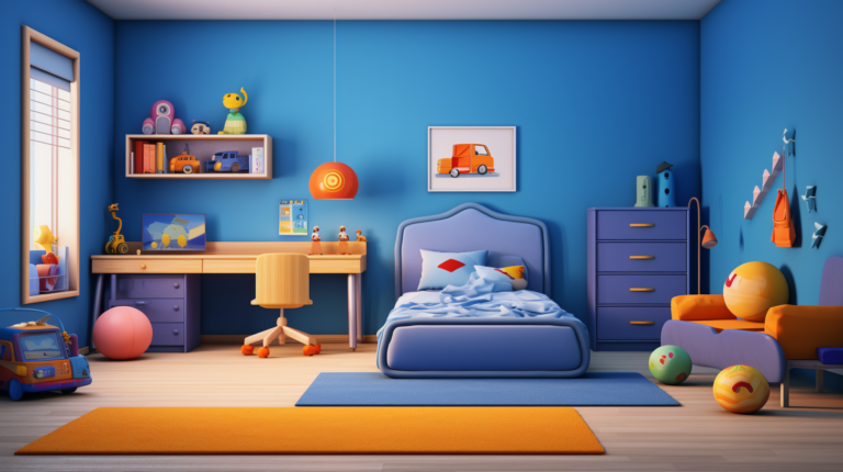
When it comes to creating a peaceful and relaxing atmosphere in your bedroom, choosing the right color can make all the difference. The color you paint your walls can set the mood, evoke emotions, and even impact your quality of sleep. If you’re looking for inspiration, here are some of the most popular color scheme for your bedroom in 2024.
Green
Green is a versatile and refreshing color scheme for your bedroom. It can create a calming and serene environment, perfect for winding down after a long day. Whether you opt for a soft, pale green or a vibrant, emerald shade, green can bring a sense of nature and tranquility to your space.
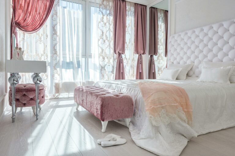
Pink
Pink is not just for little girls’ rooms anymore. Soft shades of pink, such as blush and dusty rose, are making a comeback as popular bedroom colors. These delicate hues can add a touch of femininity and warmth to your space. Pair them with neutral tones or complementary colors for a sophisticated and chic look.
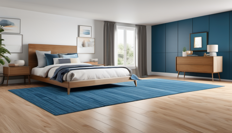
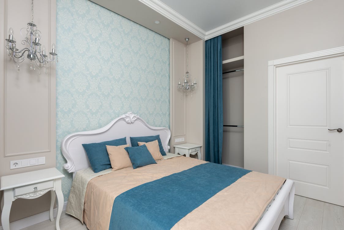
Blue
Blue is a classic and calming color scheme for your bedroom. From serene sky blue to deep and moody navy, blue hues can evoke a sense of peace and tranquility in your sleeping space. It’s no wonder that blue is a popular choice for bedroom interiors across different styles, from modern to traditional and even bohemian aesthetics.
Black

While you might think of black as a color that’s too dark for a bedroom, it’s actually a rising trend for 2024. Inky black walls can create a bold and dramatic look, perfect for those who want to make a statement. Paired with touches of metallic accents and crisp white furnishings, black can add a touch of glamour to your sleeping space.
Grey
Grey has been a popular color scheme for your bedroom for quite some time, and it’s not going away anytime soon. With endless shades to choose from, grey can add an elegant and sophisticated touch to your bedroom. Whether you prefer a light, airy grey or a deep, charcoal hue, this versatile color can create a timeless and soothing atmosphere.
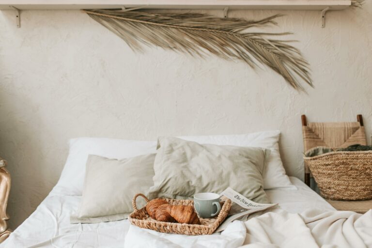
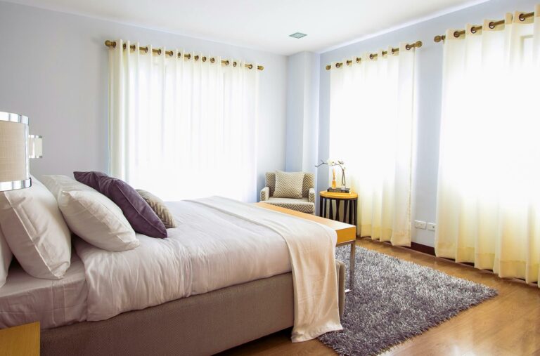
White
If you’re looking for a clean and minimalist look, white is the way to go. White walls can create an open and airy atmosphere, making your bedroom feel spacious and fresh. They also provide a blank canvas for you to play with different accents and textures in your decor.
These are just a few of the popular color scheme for your bedroom for 2024. Whether you prefer calming greens, elegant greys, bold blacks, soothing blues, warm pinks, or minimalist whites, there’s a color out there to suit your style and create the bedroom sanctuary of your dreams. So go ahead, grab that paintbrush, and transform your sleeping space into a haven of relaxation and beauty.
Consider the Mood and Ambiance
When it comes to creating a captivating space, one of the key factors to consider is the mood and ambiance. Whether you’re designing a cozy living room, a luxurious spa, or a trendy coffee shop, setting the right mood can make all the difference in creating an inviting and memorable experience for your guests. But how exactly can you create the perfect mood and ambiance?
Here are a few tips to help for choosing perfect color scheme for your bedroom:
- Choose an appropriate color scheme: Colors have a powerful impact on our emotions and can greatly influence the mood of a space. Consider using warm, earthy tones for a cozy and inviting atmosphere, or cool blues and greens for a more calming and serene ambiance.
- Lighting is key: The right lighting can transform a space and set the mood instantly. Use a combination of ambient, task, and accent lighting to create a layered and dynamic effect. Dimmers are especially useful as they allow you to adjust the intensity of the light to suit different moods and occasions.
- Pay attention to scent: Scents can have a profound effect on our emotions and can instantly transport us to another time or place. Consider using scented candles, essential oil diffusers, or fresh flowers to add a pleasing aroma to your space. Just be sure to choose scents that are not overpowering or offensive.
- Texture and materials: The materials and textures you choose for your space can greatly enhance the mood and ambiance. Soft, plush fabrics can create a sense of coziness, while sleek and modern materials can evoke a more sophisticated feel. Mix and match textures to add depth and visual interest to your space.
Remember, creating the perfect mood and ambiance is all about engaging the senses and creating a space that feels welcoming and comfortable. By paying attention to details such as color, lighting, scent, and texture, you can create a space that leaves a lasting impression on your guests. So go ahead and get creative – it’s time to set the stage for an unforgettable experience!
Learn more: Looking for inspiration on how to create the perfect mood and ambiance? Read more about the importance of personal preference in bedroom
Color Psychology
Color psychology is the study of how colors can affect human behavior, emotions, and attitudes. Understanding the psychology of color is essential in various fields, including marketing, design, and even personal branding. From the colors we choose to wear to the colors we use in our home or office, each hue has the power to evoke specific emotions and impact our overall well-being. Here are some color psychology for choosing perfect color scheme for your bedroom :
How Colors Influence Emotions
Colors have the ability to evoke a range of emotions, and different colors can elicit different feelings in individuals. Here are a few examples for choosing perfect color scheme for your bedroom :
- Red: Red is often associated with energy, passion, and excitement. It can increase heart rate and create a sense of urgency, making it a popular choice in marketing to grab attention.
- Blue: Blue is often associated with calmness, trust, and reliability. It has a soothing effect on the mind and is commonly used in healthcare and finance industries.
- Yellow: Yellow is often associated with happiness, optimism, and creativity. It can stimulate the brain and encourage positive thinking, making it a popular choice in industries related to art and innovation.
Cultural Influences on Color Perception
It’s important to note that the perception and meaning of colors can vary across different cultures. For example:
- White: In Western cultures, white is often associated with purity and weddings. However, in some Eastern cultures, white is associated with mourning and funerals.
- Green: In many Western cultures, green is associated with nature and environmentalism. However, in some Eastern cultures, green is associated with wealth and prosperity.
The Impact of Color in Branding and Marketing
In the world of branding and marketing, color plays a vital role in creating a strong brand identity and influencing consumer behavior. Here are a few examples:
- McDonald’s: The golden arches of McDonald’s are designed to stimulate appetite and convey a sense of warmth and friendliness.
- Coca-Cola: The vibrant red color used by Coca-Cola is associated with energy, excitement, and happiness, making it instantly recognizable and memorable.
Applying Color Psychology in Your Everyday Life
Whether you’re designing a website, choosing a logo, or even selecting an outfit, understanding color psychology can help you make intentional choices. Here are a few practical tips:
- Choose colors that align with your goals: Consider the emotions and associations you want to evoke in your audience or yourself and choose colors accordingly.
- Use contrasting colors: Using complementary colors or contrasting hues can create visual interest and make your designs or outfits stand out.
- Consider context: Keep in mind the cultural and individual associations that different colors may have in different situations.
As you can see, color psychology is a fascinating field that offers valuable insights into how colors can influence our emotions and behaviors. By applying these insights, you can harness the power of color to create impactful designs, build strong brands, and enhance your overall well-being. So next time you reach for a color palette, remember the potential impact it can have.
Harmony and Balance
Imagine walking into a room that instantly puts you at ease. The colors, the lighting, the furniture – everything seems to be in perfect harmony and balance. It’s a space that feels welcoming and comforting, allowing you to relax and recharge. Achieving such harmony and balance in our surroundings is not just a matter of aesthetics; it has a profound impact on our well-being and overall quality of life.
In the pursuit of creating harmonious and balanced spaces, it is crucial to consider various elements and principles of design. These principles guide us in arranging the components of a space in a way that creates a visually pleasing and cohesive whole. Let’s explore some key principles that can help you achieve harmony and balance in your home or workspace.
1. Unity and Cohesion
Unity refers to the sense of oneness or coherence in a space. It is achieved when all elements in a room work together to create a cohesive look. When there is unity, everything feels connected and in harmony. Cohesion is closely related to unity, and it refers to the visual and functional consistency of the design elements. To achieve unity and cohesion:
- Use a consistent color palette throughout the space.
- Choose furniture and accessories that complement each other in terms of style and proportion.
- Create a visual flow by using repetitive elements, such as colors, patterns, or shapes.
2. Balance
Balance is another fundamental principle of design that contributes to harmony. It refers to the distribution of visual weight in a space, creating a sense of equilibrium. There are three types of balance:
- Symmetrical balance: Achieved when two halves of a space mirror each other in terms of form, size, and placement. Think of a room with two identical chairs on either side of a fireplace.
- Asymmetrical balance: Involves arranging different elements in a space to achieve an overall sense of equilibrium. For example, a large piece of artwork on one side of the room balanced by a grouping of smaller objects on the other side.
- Radial balance: Occurs when elements are arranged around a central point, like a circular dining table with chairs placed evenly around it.
3. Proportion and Scale
Proportion and scale play a crucial role in creating a harmonious space. They refer to the size and relationship of objects to each other and the space they occupy. Consider the following tips for achieving proportion and scale:
- Maintain a balance between large and small elements in the space.
- Ensure that furniture and accessories are appropriately sized for the room.
- Pay attention to the height and width of objects to create a sense of balance.
4. Rhythm and Repetition
Rhythm and repetition add visual interest and a sense of continuity to a space. They create a flow that guides the eye and creates a harmonious experience. Key considerations for incorporating rhythm and repetition:
- Use repetitive patterns, colors, or shapes in textiles, artwork, or accessories.
- Create a rhythm by repeating similar elements at intervals throughout the space.
- Establish a visual rhythm with the placement of furniture or lighting fixtures.
By considering these design principles, you can create spaces that exude harmony and balance, promoting a sense of peace and well-being. Whether it’s your home or workspace, a harmonious environment has the power to positively impact your mood, productivity, and overall happiness. So, take the time to create spaces that nurture and uplift you, and enjoy the transformative effects of harmony and balance in your daily life.
Also Read : The Role of Colors in Minimalist Design
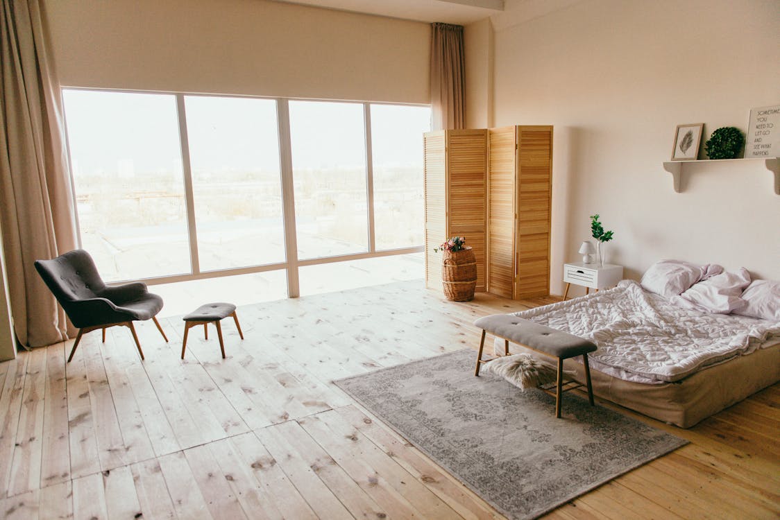
Natural Light and Room Size

When designing a space, whether it’s a home or an office, one important consideration is natural light and its relationship with the room size. The amount of natural light that enters a room can greatly impact its overall atmosphere and functionality. Here, we’ll explore the significance of natural light and its connection to room size, offering practical insights and tips for maximizing the benefits.
The Importance of Natural Light
Natural light has a significant impact on the way we perceive and experience a space. It not only enhances the aesthetics of a room but also plays a crucial role in our overall well-being.
Here are a few reasons why natural light is so important for choosing perfect color scheme for your bedroom:
- Mood Enhancement: Exposure to natural light has been linked to improved mood and increased productivity. It helps regulate our circadian rhythm, promoting better sleep patterns and overall mental wellness.
- Visual Comfort: Natural light provides a more balanced and pleasant visual experience compared to artificial lighting. It reduces eye strain and helps maintain comfortable visibility throughout the day.
- Energy Efficiency: Relying on natural light can significantly reduce the need for artificial lighting during daylight hours, leading to energy conservation and lower electricity bills.
Natural Light and Room Size
The size of a room plays a crucial role in the amount of natural light it receives. Larger rooms generally have more surface area for windows, allowing for greater light penetration. However, this doesn’t mean that smaller rooms are destined to be dark and gloomy. With strategic design choices, even compact spaces can be flooded with natural light.
Consider the following factors when working with different room sizes:
- Window Size and Placement: Install windows that are proportionate to the room size. Larger windows or multiple windows can help bring in more light. Placing windows strategically to capture the most sunlight throughout the day can also enhance natural lighting.
- Mirrors and Reflective Surfaces: Utilize mirrors and other reflective surfaces to bounce natural light around the room. This technique helps amplify the effect of natural light, making the space feel brighter and more spacious.
- Light-colored Paint and Décor: Opt for light-colored walls, flooring, and furniture to maximize the reflection of natural light. Lighter hues create an illusion of openness, making the room appear more airy and well-lit.
When it comes to designing a space, considering the relationship between natural light and room size is essential. Whether you’re working with a large room or a small one, the amount and quality of natural light can greatly impact the overall feel and functionality of the space. By incorporating strategies such as appropriate window placement, mirrors, and light-colored décor, you can optimize natural light and create a welcoming and well-lit environment.
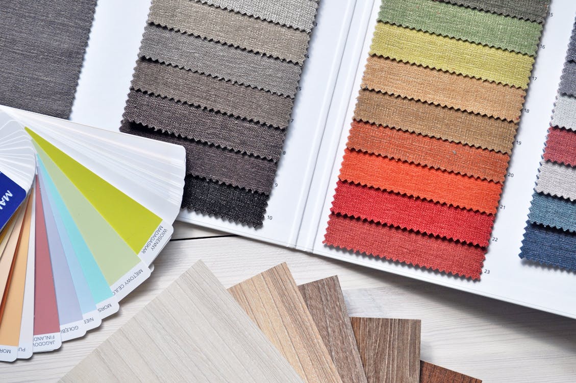
Test Samples and Lighting

When it comes to conducting tests and experiments, the quality of the lighting conditions can have a significant impact on the results. Proper lighting ensures accurate and reliable data, while inadequate lighting can introduce errors and inconsistencies. In this section, we will explore the importance of test samples and lighting in various scientific and research fields.
The Role of Lighting in Test Samples
Lighting plays a crucial role in test samples across a wide range of industries and disciplines. Here are a few examples:
- Medical Research: In medical research, lighting conditions are critical for examining biological samples, such as cells under a microscope. Proper lighting enables researchers to observe cellular structures and detect any abnormalities accurately.
- Product Testing: Manufacturers rely on consistent and precise lighting conditions to evaluate product performance and quality. Whether it’s testing the color accuracy of a display or examining the durability of a material, controlled lighting ensures fair and accurate assessments.
- Food and Beverage Industry: When it comes to testing food and beverages, lighting is essential for assessing color, clarity, and overall appearance. Proper lighting conditions help detect impurities, spoilage, or any deviations from the desired standards.
Challenges in Lighting Test Samples
While proper lighting is crucial for accurate testing, it’s not without its challenges. Here are a couple of common issues that researchers and professionals encounter:
- Inconsistent Lighting: Achieving consistent lighting conditions can be difficult, especially in large-scale testing facilities or natural environments. Variations in light intensity, color temperature, and even ambient light can affect the test results. Researchers need to ensure that the lighting setup remains consistent throughout the experiment.
- Controlling Reflections: Reflections can distort the visual representation of test samples. For example, shiny or reflective surfaces can bounce light, creating glare that hinders accurate observation. Minimizing and controlling reflections is crucial to obtain true and reliable data.
Techniques for Optimizing Lighting in Test Samples
To overcome the challenges associated with lighting test samples, researchers and professionals employ various techniques. Here are a few to consider:
- Uniform Lighting: Using diffusers, filters, or controlled light sources ensures uniform lighting across the entire sample area. This helps mitigate inconsistencies caused by variations in distance from the light source.
- Polarized Lighting: Polarized lighting techniques use filters to reduce glare and reflections. By aligning the light waves in a specific direction, researchers can minimize unwanted reflections, enabling clearer and more accurate observations.
- Lighting Spectrums: Different samples may require specific lighting spectrums to enhance contrast or highlight specific characteristics. For example, ultraviolet light is commonly used to reveal fluorescence in certain materials. Understanding the unique lighting needs of each test sample is crucial for optimal results.
In conclusion, proper lighting is essential when conducting tests and experiments. It ensures reliable and accurate data, allowing researchers and professionals to make informed decisions based on their findings. By understanding the role of lighting in test samples and employing techniques to optimize it, professionals can enhance the quality of their research and testing processes.
Accessorizing with Color

When it comes to designing your bedroom, color is a powerful tool that can transform the entire look and feel of the space. Once you have chosen the perfect color scheme for your walls, it’s time to start thinking about how you can accessorize with color to create a cohesive and stylish space. Here are some essential tips for accessorizing with color in your bedroom:
Using Colorful Bedding and Throws
One of the easiest and most effective ways to incorporate color into your bedroom is through the use of colorful bedding and throws. Whether you prefer bold, vibrant hues or soft, muted tones, your bedding can serve as a statement piece and add a pop of color to your overall design. Consider the following ideas:
- Choose a duvet cover or quilt in a contrasting color to create visual interest.
- Mix and match different patterns and textures to add depth to your bed.
- Use decorative pillows and throws in complementary colors to tie the look together.
Adding Color with Artwork and Decor
Artwork and decor are another fantastic way to infuse your bedroom with color and personality. Here are some suggestions for incorporating color through artwork and decor:
- Hang a colorful piece of artwork above your bed to serve as a focal point.
- Display vibrant photo frames or wall hangings on your bedroom walls.
- Place colorful vases, candles, or other decorative items on your bedside table or dresser.
Remember to choose artwork and decor that align with your personal style and the overall theme of your bedroom.
Introducing Colorful Furniture
If you’re feeling a bit bolder and want to make a statement, consider incorporating colorful furniture into your bedroom design. Here are a few ideas to consider:
- Option for a colorful headboard or bed frame to add a pop of color to the room.
- Choose a vibrant accent chair or ottoman to create a cozy reading nook.
- Paint an old dresser or bedside table in a bold hue to add a touch of personality.
By incorporating colorful furniture, you can create a truly unique and visually striking bedroom space. Remember, when accessorizing with color, it’s important to strike a balance and avoid overwhelming the space. Take into account the size of your room and the existing color scheme to ensure a harmonious design. Experiment with different combinations and have fun creating a bedroom that reflects your personal style and brings you joy.
Frequently Asked Questions
- What factors should consider when choosing a color scheme for your bedroom?When choosing perfect color scheme for your bedroom, consider factors such as the size of the room, the amount of natural light, your personal preference, the mood you want to create, and the existing furniture and decor.
- What are some popular color schemes for your bedroom?Some popular color scheme for your bedroom include: 1. Neutral tones like beige, cream, and gray, 2. Soft and calming pastel shades like light blue, lavender, and mint green, 3. Warm and cozy colors like earthy browns, deep reds, and golden yellows.
- How can I create a relaxing atmosphere in my bedroom with colors?To create a relaxing atmosphere in your bedroom, opt for soothing colors like soft blues, greens, and neutrals. Avoid bright and bold colors that may be too stimulating. Additionally, using cool-toned colors and incorporating natural elements can help promote a calm ambiance.
- Can I use multiple color scheme for your bedroom ?Yes, you can use multiple color scheme for your bedroom, but make sure they complement each other and create a cohesive look. Consider using a neutral base color and adding pops of complementary or contrasting colors for interest and visual appeal.
- Should I consider the psychological effects of colors when choosing perfect color scheme for your bedroom ?Yes, it’s important to consider the psychological effects of colors when choosing perfect color scheme for your bedroom. Different colors can evoke different emotions and moods, so select colors that align with the atmosphere you want to create in your bedroom, whether it’s calming, energizing, or cozy.